Case study
Figcoms
UX | UI
Art Direction
Motion Design
Figcoms is a workflow platform built on a simple idea: Figma comments are powerful, but the work around them is broken. Instead of pulling teams out of Figma, Figcoms extends it turning scattered comments into a structured, syncable workflow that lives where the work already happens.
Role
Brand & Product Design
Timeline
4 months
Year
2025
Team
Co-Founder
Case study
Figcoms
UX | UI
Art Direction
Motion Design
Figcoms is a workflow platform built on a simple idea: Figma comments are powerful, but the work around them is broken. Instead of pulling teams out of Figma, Figcoms extends it turning scattered comments into a structured, syncable workflow that lives where the work already happens.
Role
Brand & Product Design
Timeline
4 months
Year
2025
Team
Co-Founder
Case study
Figcoms
UX | UI
Art Direction
Motion Design
Figcoms is a workflow platform built on a simple idea: Figma comments are powerful, but the work around them is broken. Instead of pulling teams out of Figma, Figcoms extends it turning scattered comments into a structured, syncable workflow that lives where the work already happens.
Role
Brand & Product Design
Timeline
4 months
Year
2025
Team
Co-Founder
Overview
Figcoms started from a problem every product team eventually hits: at small scale, Figma comments are a superpower fast, visual, in-context. At team scale, they become noise. Hundreds of comments across frames. Unclear ownership. Lost priorities. Conversations that drift into Slack, Notion, and tickets far from the design.
Figcoms started from a problem every product team eventually hits: at small scale, Figma comments are a superpower fast, visual, in-context. At team scale, they become noise. Hundreds of comments across frames. Unclear ownership. Lost priorities. Conversations that drift into Slack, Notion, and tickets far from the design.
Figcoms started from a problem every product team eventually hits: at small scale, Figma comments are a superpower fast, visual, in-context. At team scale, they become noise. Hundreds of comments across frames. Unclear ownership. Lost priorities. Conversations that drift into Slack, Notion, and tickets far from the design.
Overview
Figcoms started from a problem every product team eventually hits: at small scale, Figma comments are a superpower fast, visual, in-context. At team scale, they become noise. Hundreds of comments across frames. Unclear ownership. Lost priorities. Conversations that drift into Slack, Notion, and tickets far from the design.
The Challenge
Designers, developers, PMs, and clients all comment inside Figma but the moment a project crosses ten frames, the system breaks down. Important feedback gets buried. Tasks are tracked manually in external tools. Handoffs are unclear. Status updates happen three times in three different places. Replacing Figma was off the table. Whatever we built had to feel like an extension of an existing habit not a new tool to learn.
THE SOLUTION
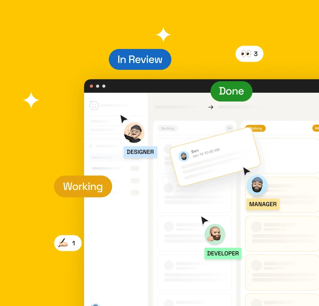
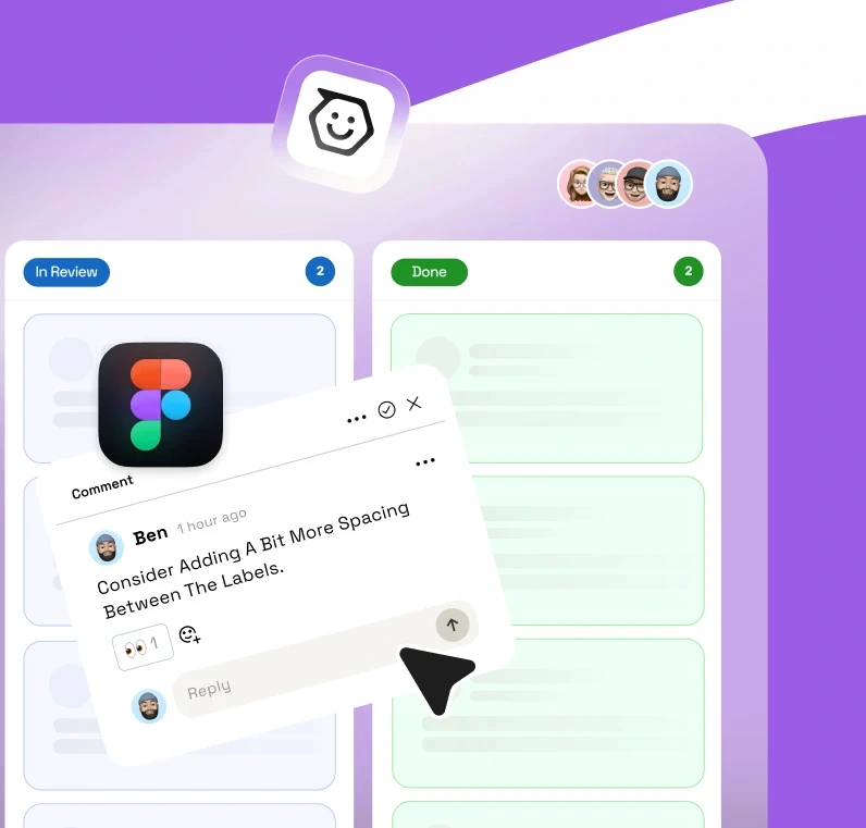
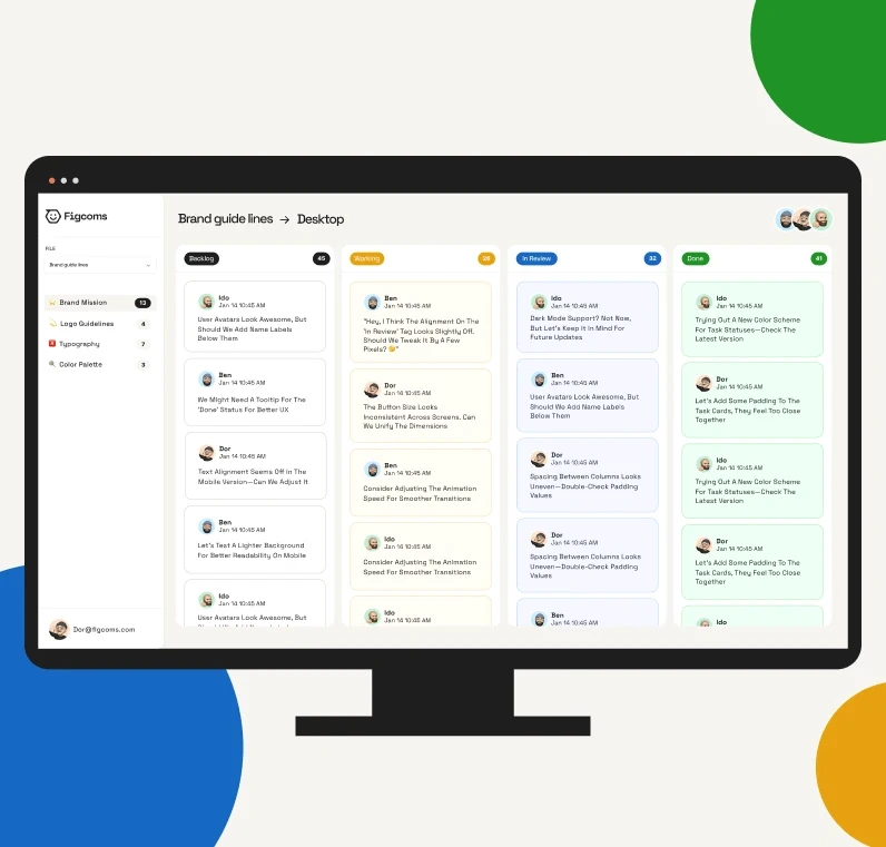
Figcoms reads the file you already share. Comments become structured tasks across Backlog → Working → In Review → Done. Replies stay threaded with the work. A real-time sync layer pushes every status change, reaction, and resolution back into Figma so what your team sees in Figcoms is exactly what they see in the file. The result is a workflow that feels lighter than a project tool and sharper than scattered comments.
The Challenge
Designers, developers, PMs, and clients all comment inside Figma but the moment a project crosses ten frames, the system breaks down. Important feedback gets buried. Tasks are tracked manually in external tools. Handoffs are unclear. Status updates happen three times in three different places. Replacing Figma was off the table. Whatever we built had to feel like an extension of an existing habit not a new tool to learn.
THE SOLUTION
Figcoms reads the file you already share. Comments become structured tasks across Backlog → Working → In Review → Done. Replies stay threaded with the work. A real-time sync layer pushes every status change, reaction, and resolution back into Figma so what your team sees in Figcoms is exactly what they see in the file. The result is a workflow that feels lighter than a project tool and sharper than scattered comments.


Process
01
RESEARCH & CONTEXT
We mapped how teams actually use Figma comments today. Interviews with designers, PMs, and developers showed a consistent pattern: the comment tool is great for raising issues, terrible for tracking them. The pain pointed to ownership, priority, and continuity not to Figma itself.
01
RESEARCH & CONTEXT
We mapped how teams actually use Figma comments today. Interviews with designers, PMs, and developers showed a consistent pattern: the comment tool is great for raising issues, terrible for tracking them. The pain pointed to ownership, priority, and continuity not to Figma itself.
02
CONCEPT & FLOW
The core mechanic became "one link, instant clarity." Paste a Figma URL, get an organized workspace. From there we shaped a Kanban-style flow built around four states every team already speaks Backlog, Working, In Review, Done and stress-tested the model on real projects before any pixel was drawn.
02
CONCEPT & FLOW
The core mechanic became "one link, instant clarity." Paste a Figma URL, get an organized workspace. From there we shaped a Kanban-style flow built around four states every team already speaks Backlog, Working, In Review, Done and stress-tested the model on real projects before any pixel was drawn.
03
UX/UI & INTERACTION
The interface had to look like a workflow tool without feeling like one. Soft cards, generous whitespace, and a typographic hierarchy that lets the comment lead. Emoji-based status changes (✅ 👀 ✍️ ⚠️) replaced heavy controls fewer clicks, more personality, and a language teams already speak inside Figma.
03
UX/UI & INTERACTION
The interface had to look like a workflow tool without feeling like one. Soft cards, generous whitespace, and a typographic hierarchy that lets the comment lead. Emoji-based status changes (✅ 👀 ✍️ ⚠️) replaced heavy controls fewer clicks, more personality, and a language teams already speak inside Figma.
04
SYSTEM & EXPERIENCE
The brand had to signal calm before the product was ever opened. Identity, motion language, and landing page were built in parallel with the app so the marketing surface and the product surface speak one sentence. Floating comments, snapping cards, and synced cursors became part of both the story and the screens.
04
SYSTEM & EXPERIENCE
The brand had to signal calm before the product was ever opened. Identity, motion language, and landing page were built in parallel with the app so the marketing surface and the product surface speak one sentence. Floating comments, snapping cards, and synced cursors became part of both the story and the screens.
Process
01
RESEARCH & CONTEXT
We mapped how teams actually use Figma comments today. Interviews with designers, PMs, and developers showed a consistent pattern: the comment tool is great for raising issues, terrible for tracking them. The pain pointed to ownership, priority, and continuity not to Figma itself.
02
CONCEPT & FLOW
The core mechanic became "one link, instant clarity." Paste a Figma URL, get an organized workspace. From there we shaped a Kanban-style flow built around four states every team already speaks Backlog, Working, In Review, Done and stress-tested the model on real projects before any pixel was drawn.
03
UX/UI & INTERACTION
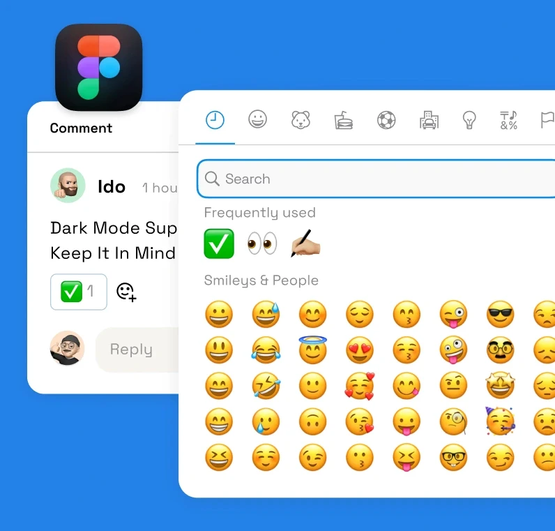
The interface had to look like a workflow tool without feeling like one. Soft cards, generous whitespace, and a typographic hierarchy that lets the comment lead. Emoji-based status changes (✅ 👀 ✍️ ⚠️) replaced heavy controls fewer clicks, more personality, and a language teams already speak inside Figma.
04
SYSTEM & EXPERIENCE
The brand had to signal calm before the product was ever opened. Identity, motion language, and landing page were built in parallel with the app so the marketing surface and the product surface speak one sentence. Floating comments, snapping cards, and synced cursors became part of both the story and the screens.
USER FLOW
The Figcoms flow is built around one promise: from chaos to clarity in under a minute. Four phases mirror how teams already work Import, Organize, Workflow, Sync collapsed into a single, low-friction loop. Every state in the product has a matching state in Figma, so the team is never out of sync, even when they're not in the same tool.
USER FLOW
The Figcoms flow is built around one promise: from chaos to clarity in under a minute. Four phases mirror how teams already work Import, Organize, Workflow, Sync collapsed into a single, low-friction loop. Every state in the product has a matching state in Figma, so the team is never out of sync, even when they're not in the same tool.
UX DESIGN
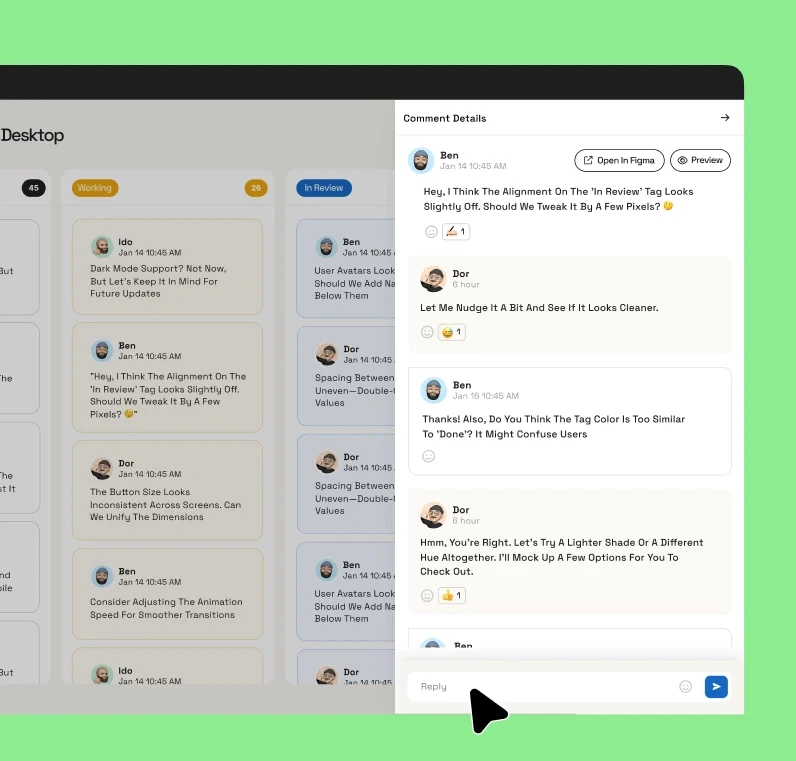
The hardest design question wasn't "how does the Kanban look?" it was "how do we make Figcoms feel like nothing." Teams already have one tool too many. So every flow defaults to the lightest path: one-click status changes, emoji shortcuts, and threaded replies that read like a chat not a ticket. The system intentionally hides complexity until you ask for it.
UX DESIGN
The hardest design question wasn't "how does the Kanban look?" it was "how do we make Figcoms feel like nothing." Teams already have one tool too many. So every flow defaults to the lightest path: one-click status changes, emoji shortcuts, and threaded replies that read like a chat not a ticket. The system intentionally hides complexity until you ask for it.
REAL-TIME SYNC
Sync is the feature that makes the rest of the product trustworthy. Every status, reaction, and reply moves bi-directionally between Figcoms and Figma in under half a second. Move a card to Done the comment closes in Figma. Reply inside Figma the thread updates in Figcoms. No exports, no copy-paste, no "wait, where's the latest?" just one shared truth across two surfaces.
REAL-TIME SYNC
Sync is the feature that makes the rest of the product trustworthy. Every status, reaction, and reply moves bi-directionally between Figcoms and Figma in under half a second. Move a card to Done the comment closes in Figma. Reply inside Figma the thread updates in Figcoms. No exports, no copy-paste, no "wait, where's the latest?" just one shared truth across two surfaces.
UI DESIGN
Visually, Figcoms sits between the calm of Notion and the precision of Linear. Rounded surfaces. Generous spacing. A muted palette with a few high-contrast accents reserved for status and motion. Typography does the work — comments are the hero of every screen, never the chrome around them. Every motion cue, from card snapping to confetti on completion, reinforces a single feeling: flow.
UI DESIGN
Visually, Figcoms sits between the calm of Notion and the precision of Linear. Rounded surfaces. Generous spacing. A muted palette with a few high-contrast accents reserved for status and motion. Typography does the work — comments are the hero of every screen, never the chrome around them. Every motion cue, from card snapping to confetti on completion, reinforces a single feeling: flow.

USER FLOW
The Figcoms flow is built around one promise: from chaos to clarity in under a minute. Four phases mirror how teams already work Import, Organize, Workflow, Sync collapsed into a single, low-friction loop. Every state in the product has a matching state in Figma, so the team is never out of sync, even when they're not in the same tool.
USER FLOW
The Figcoms flow is built around one promise: from chaos to clarity in under a minute. Four phases mirror how teams already work Import, Organize, Workflow, Sync collapsed into a single, low-friction loop. Every state in the product has a matching state in Figma, so the team is never out of sync, even when they're not in the same tool.

UX DESIGN
The hardest design question wasn't "how does the Kanban look?" it was "how do we make Figcoms feel like nothing." Teams already have one tool too many. So every flow defaults to the lightest path: one-click status changes, emoji shortcuts, and threaded replies that read like a chat not a ticket. The system intentionally hides complexity until you ask for it.
UX DESIGN
The hardest design question wasn't "how does the Kanban look?" it was "how do we make Figcoms feel like nothing." Teams already have one tool too many. So every flow defaults to the lightest path: one-click status changes, emoji shortcuts, and threaded replies that read like a chat not a ticket. The system intentionally hides complexity until you ask for it.

REAL-TIME SYNC
Sync is the feature that makes the rest of the product trustworthy. Every status, reaction, and reply moves bi-directionally between Figcoms and Figma in under half a second. Move a card to Done the comment closes in Figma. Reply inside Figma the thread updates in Figcoms. No exports, no copy-paste, no "wait, where's the latest?" just one shared truth across two surfaces.
REAL-TIME SYNC
Sync is the feature that makes the rest of the product trustworthy. Every status, reaction, and reply moves bi-directionally between Figcoms and Figma in under half a second. Move a card to Done the comment closes in Figma. Reply inside Figma the thread updates in Figcoms. No exports, no copy-paste, no "wait, where's the latest?" just one shared truth across two surfaces.

UI DESIGN
Visually, Figcoms sits between the calm of Notion and the precision of Linear. Rounded surfaces. Generous spacing. A muted palette with a few high-contrast accents reserved for status and motion. Typography does the work — comments are the hero of every screen, never the chrome around them. Every motion cue, from card snapping to confetti on completion, reinforces a single feeling: flow.
UI DESIGN
Visually, Figcoms sits between the calm of Notion and the precision of Linear. Rounded surfaces. Generous spacing. A muted palette with a few high-contrast accents reserved for status and motion. Typography does the work — comments are the hero of every screen, never the chrome around them. Every motion cue, from card snapping to confetti on completion, reinforces a single feeling: flow.
FROM FEEDBACK TO FLOW
From brand strategy to product experience, every decision was guided by one goal: helping teams spend less time managing feedback and more time building great products.
FROM FEEDBACK TO FLOW
From brand strategy to product experience, every decision was guided by one goal: helping teams spend less time managing feedback and more time building great products.
FROM FEEDBACK TO FLOW
From brand strategy to product experience, every decision was guided by one goal: helping teams spend less time managing feedback and more time building great products.
The Art Lab
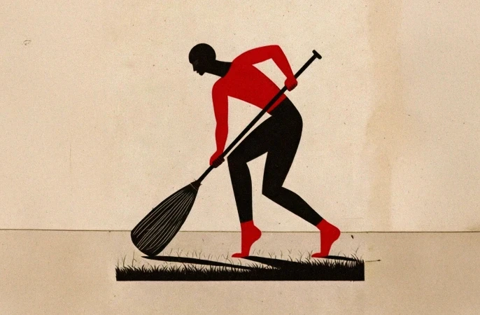
Let’s get one thing straight, I don't always play nicely within the lines. Welcome to my creative playground, This space is my unapologetic tribute to pure, unfiltered art. It’s where I completely ditch the grid, smash conventional aesthetics, and let my weirdest, most colorful thoughts run wildly out of control.

Think of this section as a beautiful, chaotic dump of my personal illustrations, bold paintings, and non-stop visual experiments. It’s loud, it’s a little bit rebellious, and it’s driven entirely by raw creative instinct. No logic, no constraints, just pure art making a mess. Care to take a peek inside the madness?
The Art Lab
Let’s get one thing straight, I don't always play nicely within the lines. Welcome to my creative playground, This space is my unapologetic tribute to pure, unfiltered art. It’s where I completely ditch the grid, smash conventional aesthetics, and let my weirdest, most colorful thoughts run wildly out of control.
Think of this section as a beautiful, chaotic dump of my personal illustrations, bold paintings, and non-stop visual experiments. It’s loud, it’s a little bit rebellious, and it’s driven entirely by raw creative instinct. No logic, no constraints, just pure art making a mess. Care to take a peek inside the madness?
The Art Lab
Let’s get one thing straight, I don't always play nicely within the lines. Welcome to my creative playground, This space is my unapologetic tribute to pure, unfiltered art. It’s where I completely ditch the grid, smash conventional aesthetics, and let my weirdest, most colorful thoughts run wildly out of control.
Think of this section as a beautiful, chaotic dump of my personal illustrations, bold paintings, and non-stop visual experiments. It’s loud, it’s a little bit rebellious, and it’s driven entirely by raw creative instinct. No logic, no constraints, just pure art making a mess. Care to take a peek inside the madness?

Somewhere between structure and instinct.
© 2026 Pamidor Studio. All rights reserved.
Somewhere between structure and instinct.
© 2026 Pamidor Studio. All rights reserved.