Paprika
Paprika
Art Direction
Design Studio
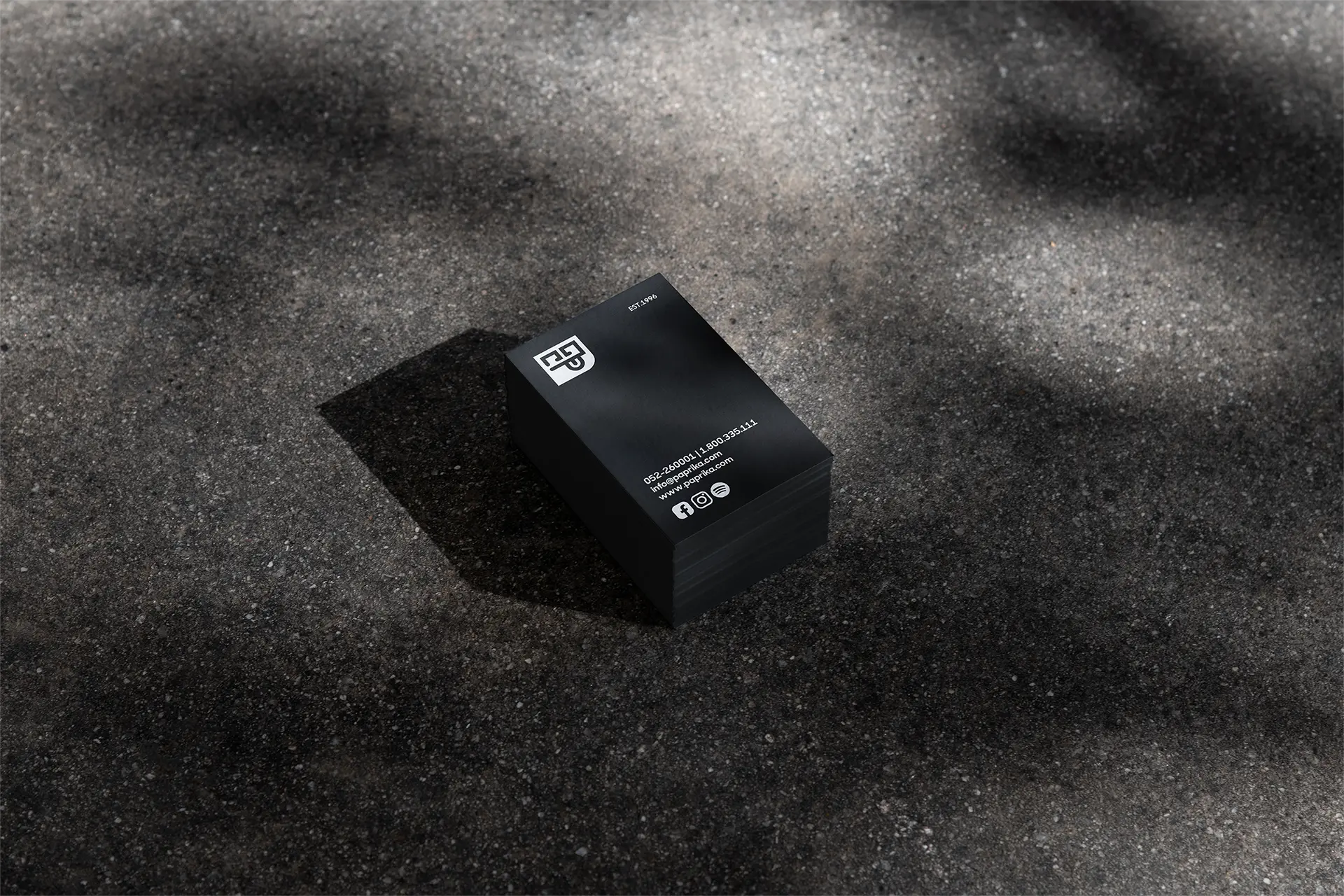
Paprika Musica is a music company with a strong cultural voice. I led a brand refresh that kept its recognizable core, rebuilt the identity around it, and expanded the system across digital, motion, and marketing assets.
Role
Lead Designer
Timeline
3 months
Year
2024
Team
Studio project
Paprika
Art Direction
Design Studio
Paprika Musica is a music company with a strong cultural voice. I led a brand refresh that kept its recognizable core, rebuilt the identity around it, and expanded the system across digital, motion, and marketing assets.
Role
Lead Designer
Timeline
3 months
Year
2024
Team
Studio project
Overview
Paprika Musica already had a name, audience, and recognizable energy. The project was not about starting over it was about sharpening the brand, cleaning the system, and giving it a stronger visual language for every touchpoint.
Paprika Musica already had a name, audience, and recognizable energy. The project was not about starting over it was about sharpening the brand, cleaning the system, and giving it a stronger visual language for every touchpoint.
Paprika Musica already had a name, audience, and recognizable energy. The project was not about starting over it was about sharpening the brand, cleaning the system, and giving it a stronger visual language for every touchpoint.
Overview
Paprika Musica already had a name, audience, and recognizable energy. The project was not about starting over it was about sharpening the brand, cleaning the system, and giving it a stronger visual language for every touchpoint.
The Challenge
The brand needed to evolve without losing itself. The existing foundation had to stay familiar, while the new identity had to feel more mature, flexible, and ready for digital campaigns, social content, motion, and live event communication.
THE SOLUTION
I refreshed the logo, rebuilt the visual system, and created a graphic language that could move between culture, music, and marketing. The result is a sharper identity with stronger rhythm, better structure, and a clearer brand presence.
The Challenge
The brand needed to evolve without losing itself. The existing foundation had to stay familiar, while the new identity had to feel more mature, flexible, and ready for digital campaigns, social content, motion, and live event communication.
THE SOLUTION
I refreshed the logo, rebuilt the visual system, and created a graphic language that could move between culture, music, and marketing. The result is a sharper identity with stronger rhythm, better structure, and a clearer brand presence.
Approach
01
Research & Foundation
Mapped the existing brand assets, audience, tone, and visual gaps before deciding what to keep, remove, or rebuild.
01
Research & Foundation
Mapped the existing brand assets, audience, tone, and visual gaps before deciding what to keep, remove, or rebuild.
02
Logo Refresh
Redesigned the logo around the original structure, keeping the familiar core while making it cleaner, stronger, and easier to use.
02
Logo Refresh
Redesigned the logo around the original structure, keeping the familiar core while making it cleaner, stronger, and easier to use.
03
Visual System
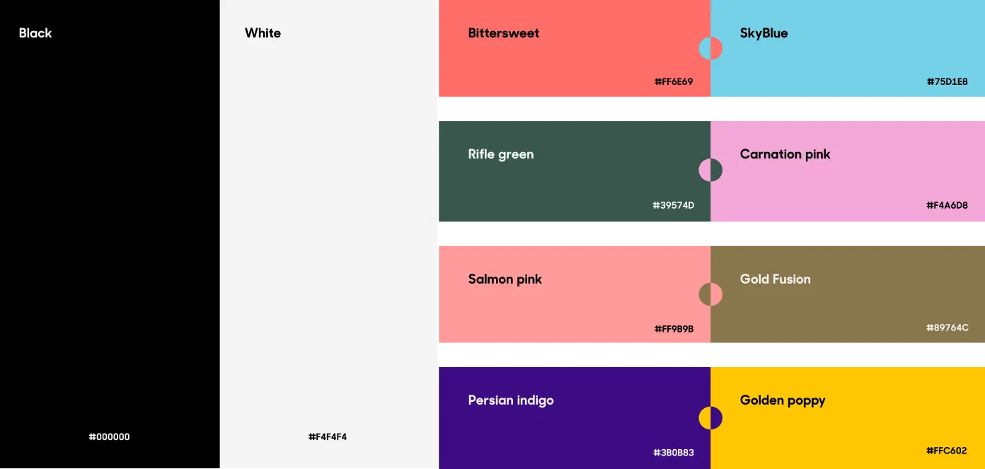
Built a bold black-and-white identity system with graphic symbols, modular layouts, and a more confident visual rhythm.
03
Visual System
Built a bold black-and-white identity system with graphic symbols, modular layouts, and a more confident visual rhythm.
04
Motion & Assets
Expanded the brand into motion, 3D, social templates, marketing materials, and digital touchpoints.
04
Motion & Assets
Expanded the brand into motion, 3D, social templates, marketing materials, and digital touchpoints.
Approach
01
Research & Foundation
Mapped the existing brand assets, audience, tone, and visual gaps before deciding what to keep, remove, or rebuild.
02
Logo Refresh
Redesigned the logo around the original structure, keeping the familiar core while making it cleaner, stronger, and easier to use.
03
Visual System
Built a bold black-and-white identity system with graphic symbols, modular layouts, and a more confident visual rhythm.
04
Motion & Assets
Expanded the brand into motion, 3D, social templates, marketing materials, and digital touchpoints.
VISUAL SYSTEM
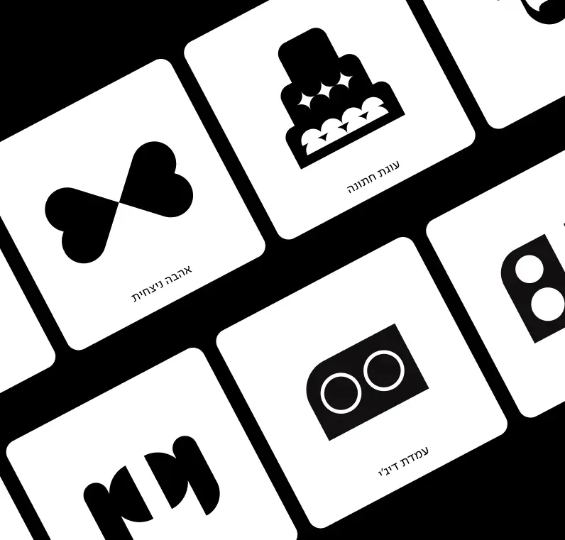
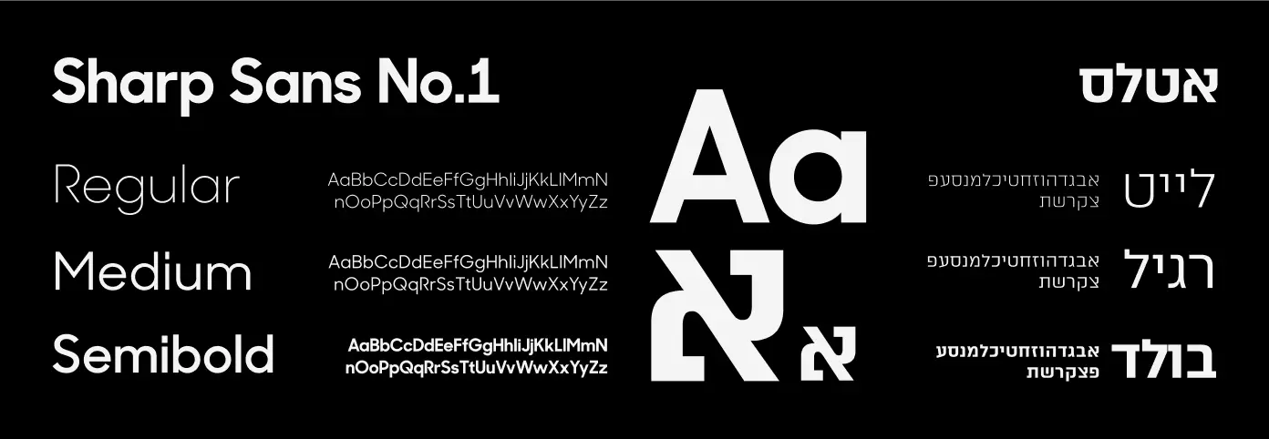
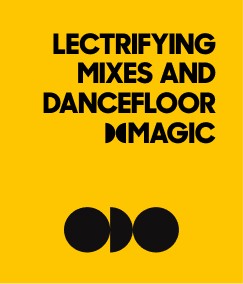
The visual system was built to give Paprika a stronger and more flexible identity without disconnecting it from the brand people already knew. I kept the foundation recognizable, then rebuilt the surrounding language with sharper typography, bold contrast, and a modular graphic system. The result is a brand that feels cleaner, more mature, and easier to scale across social content, event materials, digital campaigns, and motion pieces.
VISUAL SYSTEM
The visual system was built to give Paprika a stronger and more flexible identity without disconnecting it from the brand people already knew. I kept the foundation recognizable, then rebuilt the surrounding language with sharper typography, bold contrast, and a modular graphic system. The result is a brand that feels cleaner, more mature, and easier to scale across social content, event materials, digital campaigns, and motion pieces.
UX DESIGN
The logo refresh focused on evolution, not replacement. The goal was to preserve the original character of Paprika while cleaning the form, improving balance, and making the mark easier to use across different formats. The new symbol became the anchor of the system simple enough to work as a logo, flexible enough to become a graphic element, pattern, animation, or visual signature.
UX DESIGN
The logo refresh focused on evolution, not replacement. The goal was to preserve the original character of Paprika while cleaning the form, improving balance, and making the mark easier to use across different formats. The new symbol became the anchor of the system simple enough to work as a logo, flexible enough to become a graphic element, pattern, animation, or visual signature.
LOGO REFRESH
The logo refresh focused on evolution, not replacement. The goal was to preserve the original character of Paprika while cleaning the form, improving balance, and making the mark easier to use across different formats. The new symbol became the anchor of the system simple enough to work as a logo, flexible enough to become a graphic element, pattern, animation, or visual signature.
UI DESIGN
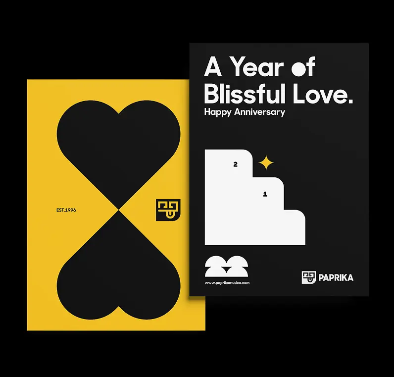
Once the identity was rebuilt, I expanded it into a set of practical brand applications. Cards, social assets, campaign visuals, and digital materials were all designed from the same core system. The focus was consistency without repetition. Every asset had to feel connected to Paprika, but still leave enough room for different artists, events, moods, and content types.
UI DESIGN
Once the identity was rebuilt, I expanded it into a set of practical brand applications. Cards, social assets, campaign visuals, and digital materials were all designed from the same core system. The focus was consistency without repetition. Every asset had to feel connected to Paprika, but still leave enough room for different artists, events, moods, and content types.
BRAND APPLICATIONS
Once the identity was rebuilt, I expanded it into a set of practical brand applications. Cards, social assets, campaign visuals, and digital materials were all designed from the same core system. The focus was consistency without repetition. Every asset had to feel connected to Paprika, but still leave enough room for different artists, events, moods, and content types.
PAYMENT & VERIFICATION
Designed for fast and flexible payments in real-world environments. Users can pay directly through their mobile device or via on-site contactless payment, powered by a third-party processing system. To ensure compliance and safety, the system includes an integrated camera for real-time age verification using facial recognition. The goal was to create a flow that feels effortless for the user while maintaining control, reliability, and trust.
PAYMENT & VERIFICATION
Designed for fast and flexible payments in real-world environments. Users can pay directly through their mobile device or via on-site contactless payment, powered by a third-party processing system. To ensure compliance and safety, the system includes an integrated camera for real-time age verification using facial recognition. The goal was to create a flow that feels effortless for the user while maintaining control, reliability, and trust.
ART DIRECTION
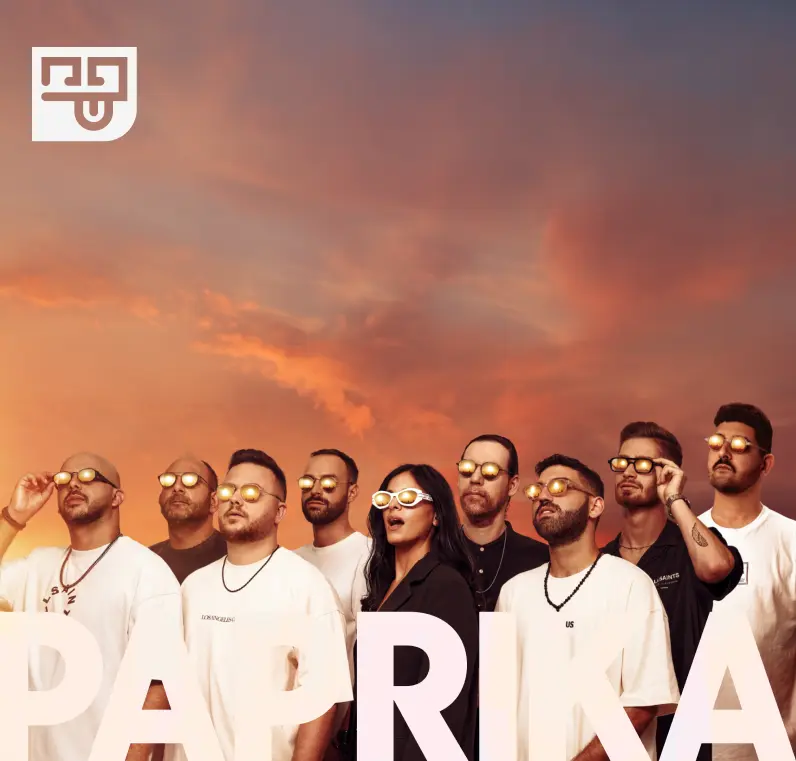
The artist imagery was designed to feel like part of the brand system, not separate promotional content. I used bold compositions, cinematic lighting, strong contrast, and oversized graphic elements to give the DJs a confident, iconic presence. Each visual keeps the artist at the center while carrying Paprika’s identity through color, typography, logo placement, and layout rhythm.


VISUAL SYSTEM
The visual system was built to give Paprika a stronger and more flexible identity without disconnecting it from the brand people already knew. I kept the foundation recognizable, then rebuilt the surrounding language with sharper typography, bold contrast, and a modular graphic system. The result is a brand that feels cleaner, more mature, and easier to scale across social content, event materials, digital campaigns, and motion pieces.
VISUAL SYSTEM
The visual system was built to give Paprika a stronger and more flexible identity without disconnecting it from the brand people already knew. I kept the foundation recognizable, then rebuilt the surrounding language with sharper typography, bold contrast, and a modular graphic system. The result is a brand that feels cleaner, more mature, and easier to scale across social content, event materials, digital campaigns, and motion pieces.
LOGO REFRESH
The logo refresh focused on evolution, not replacement. The goal was to preserve the original character of Paprika while cleaning the form, improving balance, and making the mark easier to use across different formats. The new symbol became the anchor of the system simple enough to work as a logo, flexible enough to become a graphic element, pattern, animation, or visual signature.
LOGO REFRESH
The logo refresh focused on evolution, not replacement. The goal was to preserve the original character of Paprika while cleaning the form, improving balance, and making the mark easier to use across different formats. The new symbol became the anchor of the system simple enough to work as a logo, flexible enough to become a graphic element, pattern, animation, or visual signature.
BRAND APPLICATIONS
Once the identity was rebuilt, I expanded it into a set of practical brand applications. Cards, social assets, campaign visuals, and digital materials were all designed from the same core system. The focus was consistency without repetition. Every asset had to feel connected to Paprika, but still leave enough room for different artists, events, moods, and content types.
BRAND APPLICATIONS
Once the identity was rebuilt, I expanded it into a set of practical brand applications. Cards, social assets, campaign visuals, and digital materials were all designed from the same core system. The focus was consistency without repetition. Every asset had to feel connected to Paprika, but still leave enough room for different artists, events, moods, and content types.
ART DIRECTION
The artist imagery was designed to feel like part of the brand system, not separate promotional content. I used bold compositions, cinematic lighting, strong contrast, and oversized graphic elements to give the DJs a confident, iconic presence. Each visual keeps the artist at the center while carrying Paprika’s identity through color, typography, logo placement, and layout rhythm.
ART DIRECTION
The artist imagery was designed to feel like part of the brand system, not separate promotional content. I used bold compositions, cinematic lighting, strong contrast, and oversized graphic elements to give the DJs a confident, iconic presence. Each visual keeps the artist at the center while carrying Paprika’s identity through color, typography, logo placement, and layout rhythm.


OUTCOMES
The final system gave Paprika a sharper and more complete brand presence. The identity became easier to use, easier to recognize, and more flexible across digital, social, motion, and marketing materials. Instead of a single logo refresh, the project became a full visual toolkit one that preserved the brand’s original character while giving it a cleaner, stronger, and more scalable direction.
OUTCOMES
The final system gave Paprika a sharper and more complete brand presence. The identity became easier to use, easier to recognize, and more flexible across digital, social, motion, and marketing materials. Instead of a single logo refresh, the project became a full visual toolkit one that preserved the brand’s original character while giving it a cleaner, stronger, and more scalable direction.
OUTCOMES
The final system gave Paprika a sharper and more complete brand presence. The identity became easier to use, easier to recognize, and more flexible across digital, social, motion, and marketing materials. Instead of a single logo refresh, the project became a full visual toolkit one that preserved the brand’s original character while giving it a cleaner, stronger, and more scalable direction.
OUTCOMES
The final system gave Paprika a sharper and more complete brand presence. The identity became easier to use, easier to recognize, and more flexible across digital, social, motion, and marketing materials. Instead of a single logo refresh, the project became a full visual toolkit one that preserved the brand’s original character while giving it a cleaner, stronger, and more scalable direction.
The Art Lab
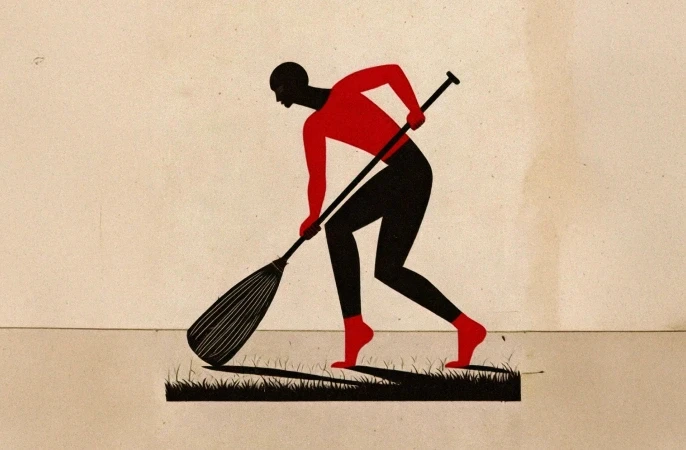
Let’s get one thing straight, I don't always play nicely within the lines. Welcome to my creative playground, This space is my unapologetic tribute to pure, unfiltered art. It’s where I completely ditch the grid, smash conventional aesthetics, and let my weirdest, most colorful thoughts run wildly out of control.
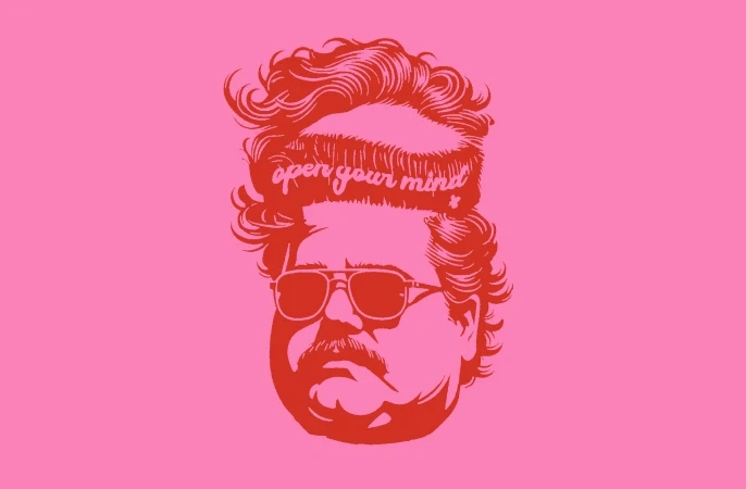
Think of this section as a beautiful, chaotic dump of my personal illustrations, bold paintings, and non-stop visual experiments. It’s loud, it’s a little bit rebellious, and it’s driven entirely by raw creative instinct. No logic, no constraints, just pure art making a mess. Care to take a peek inside the madness?
The Art Lab
Let’s get one thing straight, I don't always play nicely within the lines. Welcome to my creative playground, This space is my unapologetic tribute to pure, unfiltered art. It’s where I completely ditch the grid, smash conventional aesthetics, and let my weirdest, most colorful thoughts run wildly out of control.
Think of this section as a beautiful, chaotic dump of my personal illustrations, bold paintings, and non-stop visual experiments. It’s loud, it’s a little bit rebellious, and it’s driven entirely by raw creative instinct. No logic, no constraints, just pure art making a mess. Care to take a peek inside the madness?
The Art Lab
Let’s get one thing straight, I don't always play nicely within the lines. Welcome to my creative playground, This space is my unapologetic tribute to pure, unfiltered art. It’s where I completely ditch the grid, smash conventional aesthetics, and let my weirdest, most colorful thoughts run wildly out of control.
Think of this section as a beautiful, chaotic dump of my personal illustrations, bold paintings, and non-stop visual experiments. It’s loud, it’s a little bit rebellious, and it’s driven entirely by raw creative instinct. No logic, no constraints, just pure art making a mess. Care to take a peek inside the madness?

Somewhere between structure and instinct.
© 2026 Pamidor Studio. All rights reserved.
Somewhere between structure and instinct.
© 2026 Pamidor Studio. All rights reserved.