Case study
Gloog
UX | UI
Art Direction
Motion Design
GLOOG is built to replace traditional bars in high-demand environments. V1 is already operating in real venues with active clients, while V2 improves speed and flow with dual outputs, optimized production, and added monetization layers.
Role
Brand & Product Design
Timeline
3 months
Year
2026
Team
Solo Project
Case study
Gloog
UX | UI
Art Direction
Motion Design
GLOOG is built to replace traditional bars in high-demand environments. V1 is already operating in real venues with active clients, while V2 improves speed and flow with dual outputs, optimized production, and added monetization layers.
Role
Brand & Product Design
Timeline
3 months
Year
2026
Team
Solo Project
Case study
Gloog
UX | UI
Art Direction
Motion Design
GLOOG is built to replace traditional bars in high-demand environments. V1 is already operating in real venues with active clients, while V2 improves speed and flow with dual outputs, optimized production, and added monetization layers.
Role
Brand & Product Design
Timeline
3 months
Year
2026
Team
Solo Project
Overview
GLOOG is a smart self-service drink system designed to eliminate friction in high-demand environments. A product that merges UX, brand, and physical interaction into one seamless experience.
GLOOG is a smart self-service drink system designed to eliminate friction in high-demand environments. A product that merges UX, brand, and physical interaction into one seamless experience.
GLOOG is a smart self-service drink system designed to eliminate friction in high-demand environments. A product that merges UX, brand, and physical interaction into one seamless experience.
Overview
GLOOG is a smart self-service drink system designed to eliminate friction in high-demand environments. A product that merges UX, brand, and physical interaction into one seamless experience.
The Challenge
Long queues, slow service, and inconsistent experiences.
The goal was to remove friction and create a fast, intuitive flow within a physical product.
THE SOLUTION
A dual-screen system, one for fast ordering, one for real-time experience. Clear flows, minimal UI, and subtle upsell moments - built for speed, clarity, and scale.
The Challenge
Long queues, slow service, and inconsistent experiences.
The goal was to remove friction and create a fast, intuitive flow within a physical product.
THE SOLUTION
A dual-screen system, one for fast ordering, one for real-time experience. Clear flows, minimal UI, and subtle upsell moments - built for speed, clarity, and scale.
Process
01
RESEARCH & CONTEXT
Understanding real-world constraints, user behavior, and high-traffic environments.
01
RESEARCH & CONTEXT
Understanding real-world constraints, user behavior, and high-traffic environments.
02
CONCEPT & FLOW
Defining a frictionless ordering experience and structuring the dual-screen system.
02
CONCEPT & FLOW
Defining a frictionless ordering experience and structuring the dual-screen system.
03
UX/UI & INTERACTION
Designing clear flows, fast decision-making, and intuitive on-screen behavior.
03
UX/UI & INTERACTION
Designing clear flows, fast decision-making, and intuitive on-screen behavior.
04
SYSTEM & EXPERIENCE
Bringing together interface, motion, and physical interaction into one cohesive product.
04
SYSTEM & EXPERIENCE
Bringing together interface, motion, and physical interaction into one cohesive product.
Process
01
RESEARCH & CONTEXT
Understanding real-world constraints, user behavior, and high-traffic environments.
02
CONCEPT & FLOW
Defining a frictionless ordering experience and structuring the dual-screen system.
03
UX/UI & INTERACTION
Designing clear flows, fast decision-making, and intuitive on-screen behavior.
04
SYSTEM & EXPERIENCE
Bringing together interface, motion, and physical interaction into one cohesive product.
USER FLOW
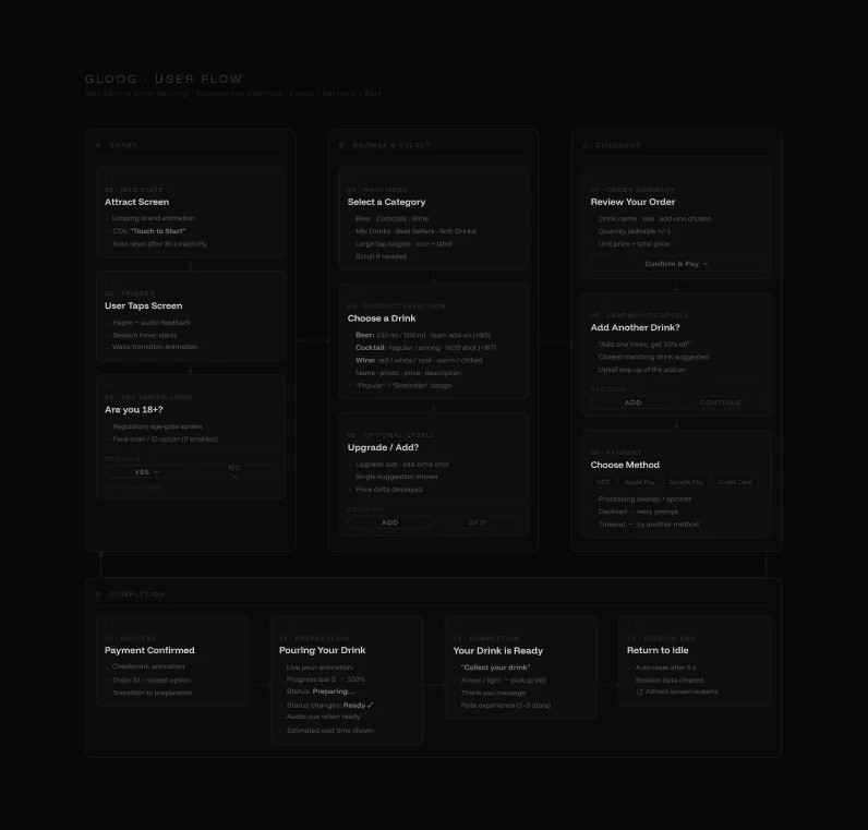
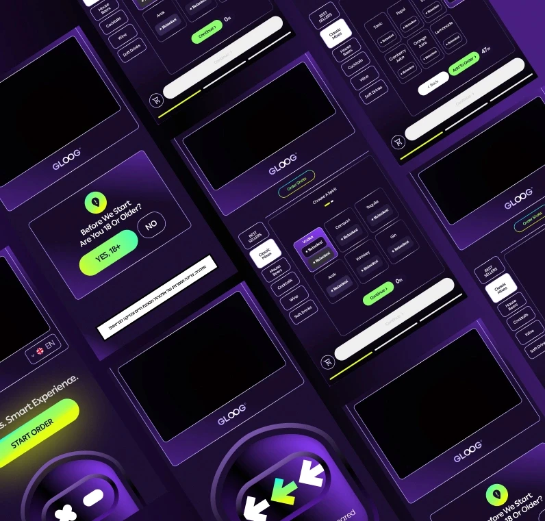
The foundation of the product was built by mapping the full journey before any visual direction was defined. This included breaking down the experience into clear macro stages, understanding user intent at each step, and defining how transitions between actions should behave. Different paths were considered across the system from first interaction to completion including alternative scenarios, interruptions, and error handling. Each state was planned to maintain continuity, guide the user forward, and prevent confusion even under pressure. The goal was to create a structured flow that feels natural, predictable, and easy to navigate, forming a solid backbone for the entire experience.
USER FLOW
The foundation of the product was built by mapping the full journey before any visual direction was defined. This included breaking down the experience into clear macro stages, understanding user intent at each step, and defining how transitions between actions should behave. Different paths were considered across the system from first interaction to completion including alternative scenarios, interruptions, and error handling. Each state was planned to maintain continuity, guide the user forward, and prevent confusion even under pressure. The goal was to create a structured flow that feels natural, predictable, and easy to navigate, forming a solid backbone for the entire experience.
UX DESIGN
The experience was shaped through a structured process of research, reference analysis, and iterative refinement. Interface decisions were informed by established patterns from high-performing products, adapting familiar behaviors into a fast-paced physical environment. Special focus was placed on layout and positioning ensuring that key actions, navigation, and feedback are always within immediate reach and easy to understand. Payment flows were simplified to reduce friction, while maintaining clarity and trust throughout the process. Upsell moments were carefully positioned to feel natural within the flow, without interrupting the user’s intent. Error states and edge cases were also designed as part of the system, providing clear guidance and maintaining continuity even when things don’t go as expected.
UX DESIGN
The experience was shaped through a structured process of research, reference analysis, and iterative refinement. Interface decisions were informed by established patterns from high-performing products, adapting familiar behaviors into a fast-paced physical environment. Special focus was placed on layout and positioning ensuring that key actions, navigation, and feedback are always within immediate reach and easy to understand. Payment flows were simplified to reduce friction, while maintaining clarity and trust throughout the process. Upsell moments were carefully positioned to feel natural within the flow, without interrupting the user’s intent. Error states and edge cases were also designed as part of the system, providing clear guidance and maintaining continuity even when things don’t go as expected.
UI DESIGN
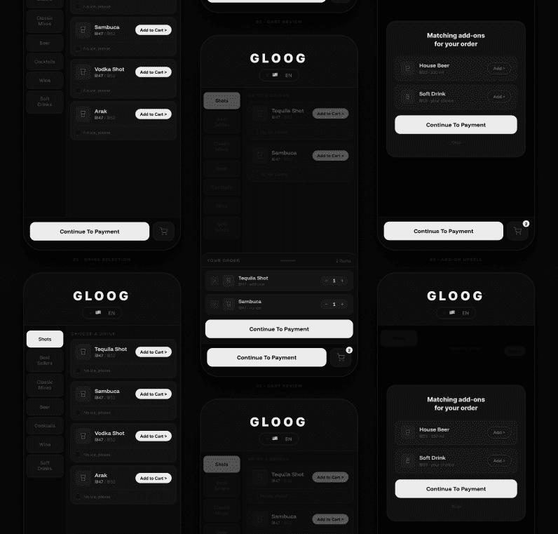
The interface uses simple motion, clear hierarchy, and well-defined button placement based on research and user behavior. Every element is positioned to reduce hesitation and support fast decision-making. The system was refined to align with the brand language while improving visual clarity, consistency, and overall usability. The result is a clean, focused interface that feels immediate and easy to navigate. The top 30% of the screen is dedicated to a dynamic advertising layer, creating space for event sponsors and branded content. This transforms the machine into an additional revenue channel, turning the interface into both a functional product and a monetizable media surface.
UI DESIGN
The interface uses simple motion, clear hierarchy, and well-defined button placement based on research and user behavior. Every element is positioned to reduce hesitation and support fast decision-making. The system was refined to align with the brand language while improving visual clarity, consistency, and overall usability. The result is a clean, focused interface that feels immediate and easy to navigate. The top 30% of the screen is dedicated to a dynamic advertising layer, creating space for event sponsors and branded content. This transforms the machine into an additional revenue channel, turning the interface into both a functional product and a monetizable media surface.
PAYMENT & VERIFICATION
Designed for fast and flexible payments in real-world environments. Users can pay directly through their mobile device or via on-site contactless payment, powered by a third-party processing system. To ensure compliance and safety, the system includes an integrated camera for real-time age verification using facial recognition. The goal was to create a flow that feels effortless for the user while maintaining control, reliability, and trust.
PAYMENT & VERIFICATION
Designed for fast and flexible payments in real-world environments. Users can pay directly through their mobile device or via on-site contactless payment, powered by a third-party processing system. To ensure compliance and safety, the system includes an integrated camera for real-time age verification using facial recognition. The goal was to create a flow that feels effortless for the user while maintaining control, reliability, and trust.



USER FLOW
The foundation of the product was built by mapping the full journey before any visual direction was defined. This included breaking down the experience into clear macro stages, understanding user intent at each step, and defining how transitions between actions should behave. Different paths were considered across the system from first interaction to completion including alternative scenarios, interruptions, and error handling.Each state was planned to maintain continuity, guide the user forward, and prevent confusion even under pressure. The goal was to create a structured flow that feels natural, predictable, and easy to navigate, forming a solid backbone for the entire experience.
USER FLOW
The foundation of the product was built by mapping the full journey before any visual direction was defined. This included breaking down the experience into clear macro stages, understanding user intent at each step, and defining how transitions between actions should behave. Different paths were considered across the system from first interaction to completion including alternative scenarios, interruptions, and error handling.Each state was planned to maintain continuity, guide the user forward, and prevent confusion even under pressure. The goal was to create a structured flow that feels natural, predictable, and easy to navigate, forming a solid backbone for the entire experience.
UI DESIGN
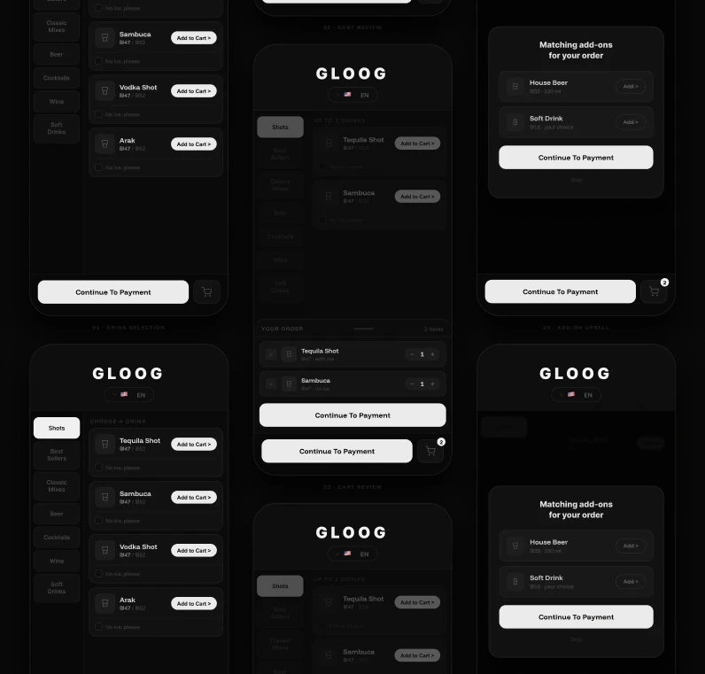
The experience was shaped through a structured process of research, reference analysis, and iterative refinement. Interface decisions were informed by established patterns from high-performing products, adapting familiar behaviors into a fast-paced physical environment. Special focus was placed on layout and positioning ensuring that key actions, navigation, and feedback are always within immediate reach and easy to understand. Payment flows were simplified to reduce friction, while maintaining clarity and trust throughout the process. Upsell moments were carefully positioned to feel natural within the flow, without interrupting the user’s intent. Error states and edge cases were also designed as part of the system, providing clear guidance and maintaining continuity even when things don’t go as expected.
UI DESIGN
The experience was shaped through a structured process of research, reference analysis, and iterative refinement. Interface decisions were informed by established patterns from high-performing products, adapting familiar behaviors into a fast-paced physical environment. Special focus was placed on layout and positioning ensuring that key actions, navigation, and feedback are always within immediate reach and easy to understand. Payment flows were simplified to reduce friction, while maintaining clarity and trust throughout the process. Upsell moments were carefully positioned to feel natural within the flow, without interrupting the user’s intent. Error states and edge cases were also designed as part of the system, providing clear guidance and maintaining continuity even when things don’t go as expected.
UI DESIGN
The interface uses simple motion, clear hierarchy, and well-defined button placement based on research and user behavior. Every element is positioned to reduce hesitation and support fast decision-making. The system was refined to align with the brand language while improving visual clarity, consistency, and overall usability. The result is a clean, focused interface that feels immediate and easy to navigate. The top 30% of the screen is dedicated to a dynamic advertising layer, creating space for event sponsors and branded content. This transforms the machine into an additional revenue channel, turning the interface into both a functional product and a monetizable media surface.
UI DESIGN
The interface uses simple motion, clear hierarchy, and well-defined button placement based on research and user behavior. Every element is positioned to reduce hesitation and support fast decision-making. The system was refined to align with the brand language while improving visual clarity, consistency, and overall usability. The result is a clean, focused interface that feels immediate and easy to navigate. The top 30% of the screen is dedicated to a dynamic advertising layer, creating space for event sponsors and branded content. This transforms the machine into an additional revenue channel, turning the interface into both a functional product and a monetizable media surface.
Fast drinks. Smart experience.

PAYMENT & VERIFICATION
Designed for fast and flexible payments in real-world environments. Users can pay directly through their mobile device or via on-site contactless payment, powered by a third-party processing system. To ensure compliance and safety, the system includes an integrated camera for real-time age verification using facial recognition. The goal was to create a flow that feels effortless for the user while maintaining control, reliability, and trust.
PAYMENT & VERIFICATION
Designed for fast and flexible payments in real-world environments. Users can pay directly through their mobile device or via on-site contactless payment, powered by a third-party processing system. To ensure compliance and safety, the system includes an integrated camera for real-time age verification using facial recognition. The goal was to create a flow that feels effortless for the user while maintaining control, reliability, and trust.

Brand Story
GLOOG was founded by event producers who have lived the pressure of high-volume service firsthand.
From nightlife venues to large-scale festivals, we’ve experienced the chaos of peak hours, long lines, staffing challenges, and the revenue lost to inefficient service.
We didn’t just want to improve it we set out to redefine it. Driven by a global vision and powered by cutting-edge technology, GLOOG is setting a new standard for beverage service at events worldwide.
GLOOG was founded by event producers who have lived the pressure of high-volume service firsthand.
From nightlife venues to large-scale festivals, we’ve experienced the chaos of peak hours, long lines, staffing challenges, and the revenue lost to inefficient service.
We didn’t just want to improve it we set out to redefine it. Driven by a global vision and powered by cutting-edge technology, GLOOG is setting a new standard for beverage service at events worldwide.
Brand Story
GLOOG was founded by event producers who have lived the pressure of high-volume service firsthand.
From nightlife venues to large-scale festivals, we’ve experienced the chaos of peak hours, long lines, staffing challenges, and the revenue lost to inefficient service.
We didn’t just want to improve it we set out to redefine it. Driven by a global vision and powered by cutting-edge technology, GLOOG is setting a new standard for beverage service at events worldwide.


PRODUCT EXPERIENCE
Bringing the brand into the physical layer through product touchpoints. The cup was designed as a direct extension of the system. Simple clear and instantly recognizable. It uses recycled materials and was developed with the machine in mind. The process included adapting to technical constraints testing real usage and making sure it fits naturally into the product flow. The goal was to make it feel like part of the system and not just packaging.
PRODUCT EXPERIENCE
Bringing the brand into the physical layer through product touchpoints. The cup was designed as a direct extension of the system. Simple clear and instantly recognizable. It uses recycled materials and was developed with the machine in mind. The process included adapting to technical constraints testing real usage and making sure it fits naturally into the product flow. The goal was to make it feel like part of the system and not just packaging.
PRODUCT EXPERIENCE
Bringing the brand into the physical layer through product touchpoints. The cup was designed as a direct extension of the system. Simple clear and instantly recognizable. It uses recycled materials and was developed with the machine in mind. The process included adapting to technical constraints testing real usage and making sure it fits naturally into the product flow. The goal was to make it feel like part of the system and not just packaging.
The Art Lab
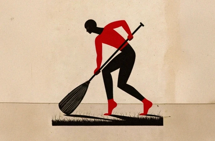
Let’s get one thing straight, I don't always play nicely within the lines. Welcome to my creative playground, This space is my unapologetic tribute to pure, unfiltered art. It’s where I completely ditch the grid, smash conventional aesthetics, and let my weirdest, most colorful thoughts run wildly out of control.
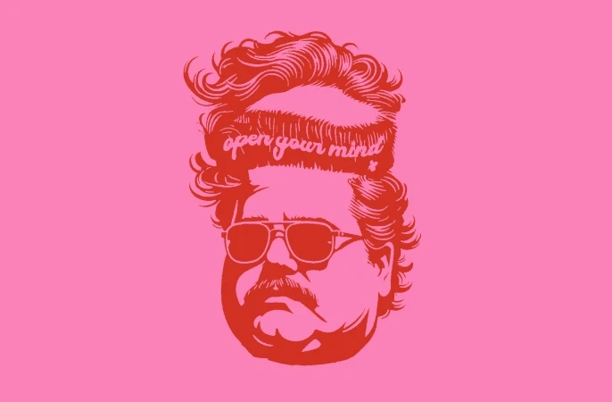
Think of this section as a beautiful, chaotic dump of my personal illustrations, bold paintings, and non-stop visual experiments. It’s loud, it’s a little bit rebellious, and it’s driven entirely by raw creative instinct. No logic, no constraints, just pure art making a mess. Care to take a peek inside the madness?
The Art Lab
Let’s get one thing straight, I don't always play nicely within the lines. Welcome to my creative playground, This space is my unapologetic tribute to pure, unfiltered art. It’s where I completely ditch the grid, smash conventional aesthetics, and let my weirdest, most colorful thoughts run wildly out of control.
Think of this section as a beautiful, chaotic dump of my personal illustrations, bold paintings, and non-stop visual experiments. It’s loud, it’s a little bit rebellious, and it’s driven entirely by raw creative instinct. No logic, no constraints, just pure art making a mess. Care to take a peek inside the madness?
The Art Lab
Let’s get one thing straight, I don't always play nicely within the lines. Welcome to my creative playground, This space is my unapologetic tribute to pure, unfiltered art. It’s where I completely ditch the grid, smash conventional aesthetics, and let my weirdest, most colorful thoughts run wildly out of control.
Think of this section as a beautiful, chaotic dump of my personal illustrations, bold paintings, and non-stop visual experiments. It’s loud, it’s a little bit rebellious, and it’s driven entirely by raw creative instinct. No logic, no constraints, just pure art making a mess. Care to take a peek inside the madness?

Somewhere between structure and instinct.
© 2026 Pamidor Studio. All rights reserved.
Somewhere between structure and instinct.
© 2026 Pamidor Studio. All rights reserved.